ART THEORY
CONCEPT ART
AF1 - Understand artistic concepts including light, colour, composition, perspective and volume.
AF2 - Understand how traditional processes have been developed and integrated into digital art software systems and processes for games, animation and VFX.
AF3 - Be able to demonstrate foundation skills in drawing for different purposes.
INTRODUCTION
There are numerous fundamentals when it comes to creating a piece of art, and it’s mostly universally agreed upon that the most vital ones are line, shape, form, colour, value, texture, and space. However, these are often grouped with principles such as composition, perspective, and light/shadow. The use of the fundamentals is an integral part of every single piece of art, whether that be a painting, an animated show, a game, or a movie. They are seen everywhere, and while their application is usually intentional, their usage is so universal and foundational that an artwork will still exhibit their use, even if the original artist didn’t plan on doing so consciously.
When it comes to the core principles, light, volume, colour, composition, and perspective are the most common ones, so breaking them down using examples from both classical pieces from the Renaissance and modern video games will serve as a comparison of how their usage can vary and how it has evolved or stayed the same.


Example of colour and composition in artwork

The Holy Family (16th century)
LIGHT
Light refers to the brightness, illumination, and radiance, and their depiction in work. Light is essential for adding volume to a piece. Light can be used in many ways, such as adding focus to a specific area, ambiance to a scene, or highlighting form on a person, object, or other subject. Ambiance is used to set the mood, and depending on the quantity of light, can be a catalyst for invoking a certain emotion in the person viewing the piece, or, in the case of a game, playing the experience. For example, minimal lighting can create feelings of unease, mystery, or fear, while an abundance of it can create safety, peace, and purity.
In the artwork The Holy Family, the infant Christ stands on the Virgin Mary’s lap, reaching up to embrace her. Saint Joseph is to the right, his hands crossed over his chest in deep respect. The soft, warm lighting in this piece affects the mood of how it is viewed, giving it a safe, friendly, and familiar ambiance. Darker areas are painted with the same warmth, adding a sense of harmony, while still also adding contrast, so that the focus of the piece stays on the Virgin Mary and Christ.
Many games also use lighting to guide the player’s attention to certain areas on the level/map. This is so that progression can run more smoothly and the gameplay experience remains enjoyable and palatable. It’s also always used to set the mood for a level/scene with 3D environments. However, light can also be used in
mechanical ways, such as in Little Nightmares II, where a level sequence requires the player to use a flashlight in order to keep mannequins from attacking. The flashlight itself creates a harsh focus on the subject the player focuses on, leaving
the rest of the screen almost completely dark, aside from the silhouetted mannequins. This setup effectively creates tension, dread, and uncertainty, which works perfectly for the themes/ genre of the game.


Little Nightmares II (2021)

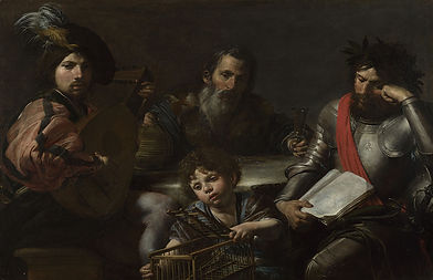
A Rocky Landscape with an Ox-cart (About 1640-5)
COLOUR

Colour refers to the way we perceive different shades and tones, playing a crucial role in conveying meaning and emotion in artwork. Colour is used to set certain moods, highlight specific elements, and create visual harmony. Different colours are historically associated with various meanings, which can change or be contradictory in nature depending on the context. For example, the colour blue in a positive context could mean tranquillity, security, or honesty, while in a negative connotation could represent sadness, coldness, or depression. A piece can use a range of different colours to create combined meanings and associations for the viewer, making it a key tool for an artist to get their message or intention across.
The piece, A Rocky Landscape with an Ox-cart, predominantly uses three colours throughout the composition: green, yellow, and blue. Green and blue are cooler colours that make up most of the canvas, but due to the artist’s application of yellow throughout the entire piece, the final visualisation has a warm tone overall, creating a very strong sense of harmony. The low sun in the painting acts as the source of light, and therefore the source of the warmer hues. The colours in the piece help create a sense of tranquillity, nature, warmth, and freshness.
Colour can also be applied to add bold and stylistic visual styles, such as in the game Jet Set Radio. Since the game’s art style is inspired by 1990s Japanese pop culture, specifically street graffiti, the game’s palette instead uses majorly vibrant and contrasting colours to add a visual distinction between the characters and
environment rather than a harmonized and consistent colour selection. The vibrant colours also set an upbeat tone for the game, directly contributing to how it’s presented and successfully representing the inspiration it drew from.


Jet Set Radio (2000)

Wanderer Above the Sea of Fog (1818)
COMPOSITION
Composition is the arrangement of elements in a work of art by using components of line, shape, colour, texture, and space to create a sense of balance, communicating the artist’s intended message with the piece in an effective way. Contrast is one of the key principles of composition, alongside emphasis, unity & variety, movement, and balance. Composition is crucial to guide the viewer’s eye to the subject of a piece naturally. There are several pre-existing compositional styles, all of which are used differently depending on the context of the piece. For example, the ‘Golden Spiral’ utilizes a mathematical pattern to strategically add more detail towards the centre of the spiral.
Wanderer Above the Sea of Fog masterfully uses multiple compositional techniques to ensure the viewer’s eye is pulled towards the centre focus, the wanderer on the rocky outcrop. Each component of the artwork, including the mountains of the horizon, the very cliff the man stands on, and the sea of fog, leads the viewer back to the centre of the artwork, the area with the most detail.


The Green Mile (1999)
Video games will usually take advantage of composition to the best of their ability, especially story-centred games, such as RPGs/JRPGs, which benefit greatly from a narrative perspective by including a well-thought-out compositional scene. For example, in the game, Metaphor: Re: Fantazio, certain cutscenes or dialogue segments will angle the viewer’s point of view in order to create a more dramatic and impactful scene for emotional or dramatic tension. During the combat UI for the game, especially during boss fights, the camera is angled from a low perspective from behind the active character to create a clear line of action between the player’s character and the opponent.


Metaphor: ReFantazio (2024)

An Evening Service at Church (1649)
PERSPECTIVE

Perspective creates the illusion of depth and three-dimensionality on a 2D surface. By involving depth, distance, and proportion, objects appear to recede into the distance, creating a realistic representation that engages the viewer.
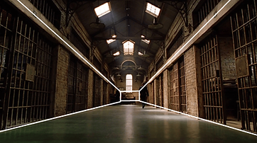
In the painting, An Evening Service in a Church, the vanishing point, which is distant at the end of the corridor, serves as a reference to the viewer about how everything else is scaled. The angle of the painting ensures that elements do not blend in with each other, and that it is clearer to distinguish where parts of the building start and end. Despite being painted on a 2D surface, the effective use of perspective allows the viewer to perceive the scene in a 3D context.
Perspective is seen anywhere with a 3D environment, including 3D animated shows, movies, and video games. In video games, a 3D environment is an opportunity to add depth, detail, worldbuilding, and a way to show rather than tell the player where to go. Perspective can be used to contextualize the scale of elements, for example, in NieR: Automata, the player has a low perspective of the world due to the playable character’s height and the general scale of everything else being largely tall. This makes the game feel much vaster and more expansive, but also makes you feel isolated and insignificant in comparison, which fits with the post-apocalyptic theming for the game.


NieR: Automata (2017)
The Four Ages of Man (Around 1629)
VOLUME
_edited.png)
Volume refers to anything that has depth due to lighting, creating a 3D shape, or the illusion of one. Traditionally, form is given to a drawing to add volume; this is done by using shadows and lighting to add detail. In digital media, volume can be utilized in other ways, such as 3D modelling in software such as Blender or Maya.
Volume is predominant in classical paintings; the high level of detail that makes a scene look realistic is a staple in almost every single piece from the Renaissance period, including the piece, The Four Ages of Man, painted around 1629. The combined use of lightning, perspective, texture, and colour creates a 3D-like illusion that makes the painting life-like
Much like perspective, volume comes with any media that uses 3D models or materials. Volume can be seen in just about any game created, unless the game intentionally doesn’t use elements such as lighting or composition, namely, 8-bit style games. In Stray, the game takes full advantage of environmental lighting to create spaces that feel fully immersive and realistic, with elements such as reflective surfaces, contrasting colours, and shadows. These are extremely important to the game itself, as the player will be spending their entire time exploring these environments, solving puzzles, and collecting items.


Stray (2022)
CONCLUSION
Overall, I believe that the core principles of art are integral to the creation of creative media, including movies, animations, paintings, and video games. Whether or not someone intentionally leaves out the usage of a single or multiple fundamentals for
their own conveyed message just adds more to the freedom that comes with being an artist. The principles should act as a guide, rather than a rulebook, so that people can develop their own unique style and be inspired, rather than feel limited to certain standards.
However, I also believe that learning about the core principles of art helps one’s artistic journey to develop into more reliable, consistent styles, including knowledge. Knowing about the fundamentals before you break any ‘rules’ will always help with the production of higher-quality work and make it easier to convey any message an artist has to share with the world, whether it be on a screen in the form of a video game or movie, or a canvas with a painting.
FRAMESTORE- CONCEPT ART
Framestore is a British visual effects and computer animation studio founded in 1986, specialising in visual effects for film and prestige TV, advertising, rides, and immersive experiences. In 2008, they won their first Academy Award for Best Visual Effects for the film The Golden Compass, also winning the BAFTA award for that same year. Some examples of films/shows that they have worked on include Chicken Run (2000), Avatar (2009), King Arthur: Legend of the Sword (2017), The Boys (2019), and many more.
For this assignment, I chose to base my inspiration on the story of Bevis of Hampton, who was a legendary English hero and the subject of numerous medieval chivalric romances. Due to the genre, the story contains many themes, such as a hero who goes from young and inexperienced to mature and hard-won, ending with his sanctified death. Supporting him is a resourceful, appealing heroine along with faithful servants and several villains.
The legend tells of Bevis' travels as he moves back and forth from England to the Near East through most of western Europe, battling dragons, giants, and other mythical creatures. The story also covers themes such as forced marriages, domestic violence, dramatic escapes, and imprisonment. Additionally, he has a horse of extreme loyalty and bravery.
The target audience for this story would be teens and adults, earning it a PG-13+ rating. I will use pre-existing movies that Framestore has worked on as a reference for what kind of designs I can create, such as their work on King Arthur: Legend of the Sword, which is also set in a medieval era, making it a great starting point.


MOODBOARD & SKETCHES
- To start, I created a moodboard based on ideas I had for potential designs/settings of the story.
- I use inspiration from both classic medieval depictions of the legend, plus other media such as Dark Souls, Elden Ring, the Harry Potter front covers, Clash Royale, How to Train your Dragon, and Vinland Saga.
- I start by sketching different ideas for Bevis' armour, as it's the most important part of his design.
CHARACTER SHEET
Using Clip Studio Paint, I use my sketches as a base to create a reference sheet for Bevis. I made a version with and without rendering, for potential lighting/surface reference or easy colour-picking with the eyedrop tool.


THUMBNAIL SKETCHES
Next, I sketched out some ideas for what the final concept art could look like. I tried making sure to vary the poses, locations, and angles as much as I could. My personal favourite is the first one, where I'll be able to follow the golden ratio to create a scene, while also being able to show Bevis standing off a monster clearly, which helps communicate to the viewer what kind of setting the story is in instantly.
The second one comes off more unclear as to what's happening, and the third, while very similar to my first thumbnail, pans the viewpoint of the piece further back, creating a more dramatic effect. However, the character won't be as clear.
The fourth thumbnail sketch uses a dramatic angle from below, with rain falling from above. While the composition is pleasing, it doesn't showcase any of the story's features, unlike the others, where Bevis is fighting a monster of some variation.
The fifth has dramatic foreshortening on the character, which would make it the most challenging to draw out of my ideas. The final thumbnail sketch I drew out uses a more cinematic inspiration, but would require a lot of planning on the monster's design.

LET'S PLAY!
FEEL FREE TO CONTACT ME FOR FUTURE WORK AND PARTNERSHIPS